Search

FREE SAAS HOMEPAGE AUDIT WORKSHEET FOR GOOGLE SHEETS & EXCEL

Make the most of your homepage with this
free homepage audit worksheet

How effective is your homepage?

After analyzing 115 SaaS websites to unveil the secrets of a successful homepage, we’ve developed a complimentary homepage audit worksheet. This resource enables you to maximize the potential of your homepage by evaluating it across five key areas: analytics, search engine optimization (SEO), conversion, website performance, and technical enhancements.

SHARE THE TOOL

By submitting this form, you agree that Sales titan may send you promotional emails about our products and services. You can unsubscribe at any time, free of charge. View our Privacy Policy.

Related automation recipes to nurture your leads and existing contacts

Connect effortlessly with your audience

Start a 14-day free trial. No credit card, no setup, no hassle.

Check out these webinars

Discover what elements are essential for your SaaS homepage! Learn valuable SaaS copywriting insights gleaned from 115 SaaStr sponsors.

What belongs on your SaaS homepage?

Should your SaaS copy be left or center-aligned?
Which visuals are ideal for a SaaS homepage?
What should your SaaS copy convey about your product, and where?
Which call-to-action suits your SaaS homepage?

Sales Titan has previously delved into copywriting, particularly for landing pages, but what about SaaS homepages?

Your homepage can directly convert leads or guide them to the most relevant information. It can serve as a brand showcase or prioritize educating prospects about your product. Which strategy suits your needs best?

To address these questions, we examined the homepages of 115 sponsors of the 2020 SaaStr Annual conference. We explored:

How SaaStr sponsors structure their copy?
Which types of visuals are prevalent on SaaS homepages?
Where do SaaS homepages commonly elaborate on their product offerings?
What varieties of CTAs appear on SaaS homepages? And how many?

Below, you’ll find insights into each query, along with SaaS copywriting tips to help you craft a more engaging, conversion-driven SaaS homepage.

Should you left or center-align your SaaS copy?

In this study, SaaStr sponsors positioned their homepage SaaS copy as follows:

56.52% of SaaS homepages featured left-aligned headlines
40.87% of SaaS homepages featured center-aligned headlines
2.61% of SaaS homepages featured right-aligned headlines

How do SAAS Homepages align their headlines?

What’s the best practice when it comes to aligning your homepage copy?

Eyetracking research from Nielsen Norman Group shows that many online readers use an “F-Shaped” pattern to scan websites for information.

According to the Nielsen Norman Group, readers typically start reading from the upper left corner and progress across the page. They often scan down the left margin and gradually read less of the page width as they continue (Source: Nielsen Norman Group).

For individuals who read left-to-right languages such as English, the top left of the page is a natural starting point for reading, as it’s where the information begins.

However, not all readers adhere to an F-shaped reading pattern. The Nielsen Norman Group identifies three factors that make people more likely to adopt an F-shaped scanning pattern:

1. Walls of text or unclear formatting, making it difficult to discern where to find information.
2. The reader is in search of information rapidly.
3. The reader’s level of engagement with the content is low, prompting them to scan rather than read thoroughly.

As long as your homepage hero remains relatively uncluttered, readers should be able to swiftly locate important information on the page.

To aid readers in finding the most critical information, consider aligning your imagery to direct attention toward that information.

A study using eye-tracking technology revealed that individuals tended to focus more on a headline when the depicted baby was also looking at it (Source: Sales Titan).

While more than half of the SaaS homepages analyzed in this study featured left-aligned text, it’s likely acceptable to use either left-aligned or center-aligned text. Experimentation through testing can provide further clarity!

What visuals should you use on a SaaS homepage?

SaaS design trends evolve rapidly, often influenced by companies observing and adopting the styles of other SaaS websites.

In our examination of SaaStr attendees, we classified visuals into four categories: “no visuals,” “illustration,” “photography,” or “product shot.” What types of visuals were most prevalent on SaaS homepages (above the fold)?

  • 43.48% of SaaS homepages incorporated illustrations in their visuals.
  • 39.13% of SaaS homepages utilized photography in their visuals.
  • 12.17% of SaaS homepages featured product shots in their visuals.
  • 5.22% of SaaS homepages lacked any visuals above the fold.

What are the predominant visuals typically employed above the fold on SaaS homepages?

In anecdotal observations, SaaS websites are increasingly favoring illustrations as their primary visual elements. Although not affiliated with SaaStr, Buffer, a social media scheduling platform, serves as a noteworthy example of this trend.

Buffer’s homepage exemplifies an illustration style that is increasingly prevalent in the SaaS industry (Source: Sales Titan).

Other frequently utilized visuals include photography and product imagery. Determining the most suitable choice for SaaS businesses involves considering the following pros and cons:

  • Illustrations are visually captivating but may not effectively convey product functionality or value. However, a distinctive illustration style can enhance brand recognition, particularly in competitive markets.
  • Photography is beneficial for illustrating how products integrate into users’ lives, with images featuring people, especially faces, being particularly attention-grabbing.
  • Product imagery is highly effective in communicating the benefits of a product. However, not all SaaS product user interfaces (UIs) are visually stimulating, and updating imagery may be necessary following significant product changes.

Of these options, Sales Titan and advertising expert David Ogilvy both advocate for using product imagery whenever feasible. Ogilvy emphasizes the importance of showcasing the product in use to enhance brand preference and encourage users to envision themselves enjoying its benefits.

To mitigate the drawbacks associated with product imagery, consider employing slightly abstracted versions of your product instead of straightforward screenshots. Annotated descriptions can highlight the benefits of featured features effectively.

ProfitWell, a sponsor of SaaStr, exemplifies this approach adeptly on their homepage.

ProfitWell’s homepage utilizes product imagery effectively, providing readers with a comprehensive understanding of the product without inundating them (Source: ProfitWell).

At Sales Titan, we adopt a similar strategy, presenting our product in a manner that facilitates quick comprehension for scanners, emphasizing the key message.

Showing an automation gives people a feel for the product without making us update the images every time we make a tweak to our UI 

If you don’t take this approach, don’t worry! 87.83% of SaaStr sponsors used something other than product shots above the fold of their homepages.

What should your SaaS copy say about your product, and where?

Where to place information about what your product does on your homepage depends on various factors, but here are some common options:

  • In the main headline
  • In the body copy above the fold
  • In the above-the-fold imagery
  • Below the fold
  • Nowhere

According to data from SaaStr sponsors:

  • 53.91% of SaaS homepages provided a product description in the main headline.
  • 41.74% of SaaS homepages included a product description in the body copy above the fold.
  • 4.35% of SaaS homepages did not feature a product description above the fold.

To ensure that potential customers understand what your product offers, consider approaches such as:

  • Addressing their pain points and offering solutions.
  • Highlighting the overarching benefits of your product.
  • Clearly stating the type of product you offer.
  • Presenting compelling features of your product.

When deciding on your homepage headline, consider the advice of positioning expert April Dunford, who emphasizes the importance of clearly defining your product category. This approach can help customers form assumptions about your product’s competitors, functionality, and pricing. Several SaaStr sponsors adopt this strategy on their homepage.

image 2020 02 17 at 4.50.29 pm 1

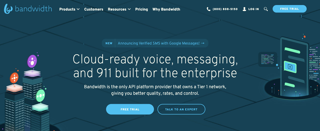
Bandwidth succinctly conveys its product’s essence in the headline of its homepage.

But what about alternative strategies? What about the timeless counsel to “sell benefits and not features”?

Several other SaaStr sponsors opt to promise overarching benefits upfront before delving into the specifics of their solutions.

image 2020 02 17 at 4.50.53 pm 1

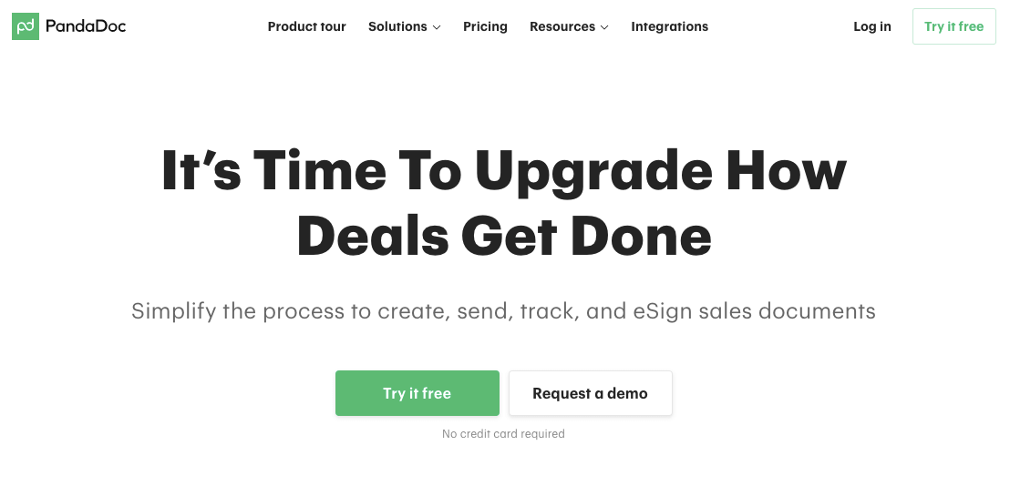
PandaDoc opts to emphasize a broad benefit of utilizing its product.

Additionally, certain SaaS applications cater to highly specific use cases, in which case explicitly stating that use case is likely the most effective approach.

8e486998bcdde247142c803c19715fed image 202020 02 13 20at 201.01.29 20pm 1 1

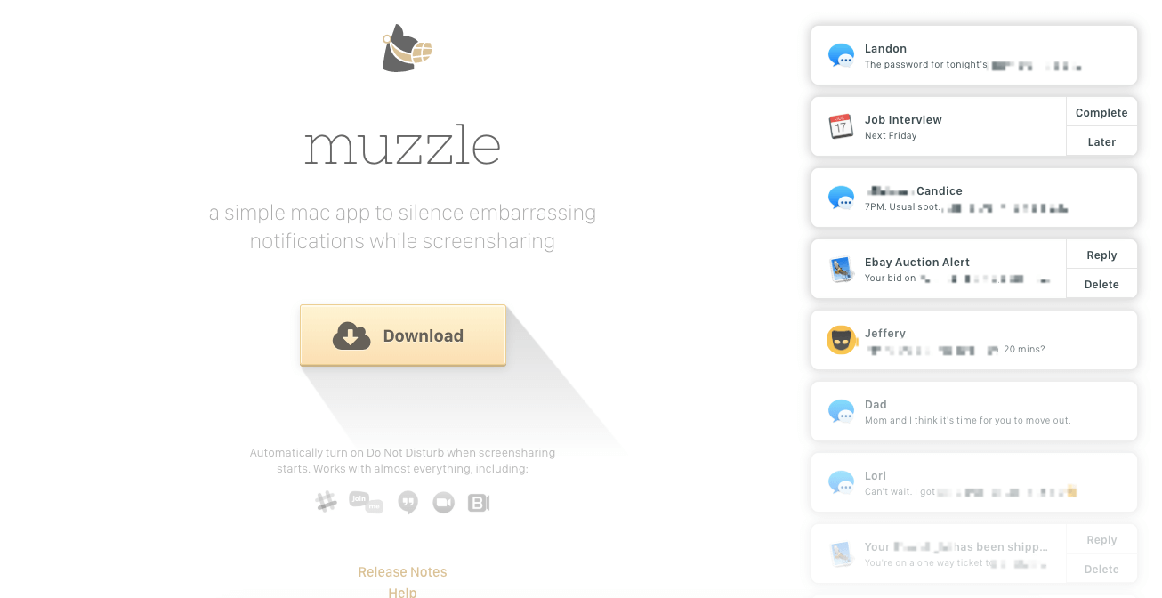
Muzzle is an application designed to conceal screen notifications, a fact clearly stated on its website.

Determining the best approach for your homepage depends on the nature of your business:

  • If you offer a single product within an established category, articulate the category and emphasize a unique selling point.
  • If your product belongs to a new category, focus on addressing a specific pain point and demonstrate how your solution resolves it.
  • If you offer multiple product lines addressing various pain points, highlight the overarching benefit delivered by all your products (and provide links to specific product pages).

Managing multiple product lines while maintaining a cohesive message can be challenging, especially as businesses expand. Atlassian effectively addresses this challenge by spotlighting a key benefit above the fold and then guiding visitors to individual product pages tailored to address specific needs.

image 2020 02 13 at 1.24.58 pm 1

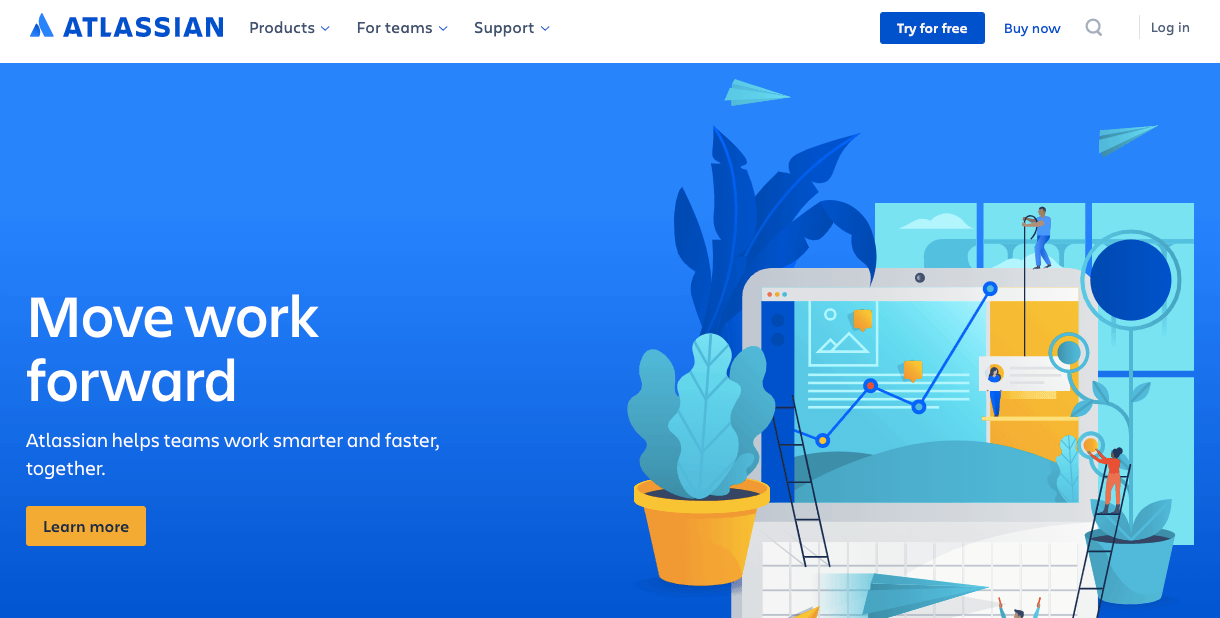
Atlassian communicates its overarching benefit prominently above the fold, then delves into more specific information below.

Below the fold, Atlassian guides users to explore individual tools tailored to their needs.

Given Atlassian’s extensive suite of tools, directing users to the most suitable tool for their use case is essential.

In SaaS copywriting, a combination of these approaches can be effective. The optimal strategy often hinges on the specific product being sold and the target audience.

What call-to-action (CTA) should you put on your SaaS homepage?

What actions do SaaStr sponsors prompt visitors to take on their homepage? According to this research:

  • 55.65% of SaaS homepages featured 1 call-to-action (CTA)
  • 31.30% of SaaS homepages featured 2 CTAs
  • 8.70% of SaaS homepages had no CTAs
  • 4 SaaS homepages included 3 CTAs, and 1 homepage featured 4 CTAs

The most commonly employed SaaS homepage CTAs were:

  • Start a free trial
  • Get a demo
  • Learn more
  • Pricing
  • Watch a video


Your SaaS homepage typically garners the highest visibility on your website, making it crucial for featuring your most important CTAs.

Determining the most critical CTAs for your homepage and whether to include multiple CTAs above the fold can be complex. Offering more choices can potentially benefit users, but be mindful that too many options can overwhelm and hinder decision-making, as per Hick’s Law.

Psychological and user experience research indicates that an abundance of choices may lead to suboptimal decisions.

So, does it mean you should stick to only one CTA on your SaaS homepage? Perhaps. While the homepage attracts unsegmented traffic, catering to visitors with diverse needs, it’s essential to consider when it might be appropriate to include multiple CTAs:

  • If your customer base varies widely, with some requiring high-touch interactions (e.g., demo) while others prefer self-serve options (e.g., trial), offering both demo and trial CTAs could be beneficial.
  • For extended sales cycles, particularly with enterprise customers who may not convert solely through a trial, a demo or video CTA could prove valuable.
  • If your sales team is limited in resources and unable to conduct demos for all potential customers, featuring a free trial or video CTA may be sensible.


The role of your homepage can vary depending on your business. While it may primarily serve as a conversion platform, it can also function as a tool for segmentation, guiding visitors to the most relevant page based on their needs.

Conclusion: SaaS copywriting for your homepage

What insights does this research offer regarding your SaaS homepage?

– While the majority of SaaS homepages feature left-aligned copy, a significant portion opt for center-aligned layout.
– Illustrations rank as the preferred visual type, closely trailed by photography. Interestingly, most SaaS homepages in this study did not showcase the product above the fold.
– Product descriptions are typically found in either the headline or body copy.
– The majority of SaaS homepages feature a single call-to-action (CTA), although a notable percentage incorporate two CTAs targeting different stages of the buying cycle.

How does your own homepage stack up against these findings?

Reach your audience with ease

Start a 14-day free trial. No credit card, no setup, no hassle.