Search

CALCULATE CART ABANDONMENT

Determine the revenue lost due to cart abandonment by calculating the value of abandoned carts multiplied by their frequency.

Unnoticed abandoned shopping carts could lead to significant sales losses. Utilize this abandoned cart calculator to uncover the cost of abandoned carts and the potential revenue gain from implementing abandoned cart emails.

SHARE THE TOOL

By submitting this form, you consent to receiving promotional emails regarding our products and services from Sales Titan. You can opt out at any time, free of charge. Please review our Privacy Policy for more information.

Subscribe to our newsletter for extra eCommerce and marketing insights.

Abandonment rates

7 Causes of Abandoned Carts
(and Strategies to Minimize Checkout Friction)

As per SaleCycle, a staggering 77% of online shopping carts are abandoned.

Over three quarters of individuals who add items to their cart ultimately exit without making a purchase. For every buyer, three potential customers hover at the brink of purchase but opt out.

Cart abandonment presents a significant revenue loss challenge for ecommerce establishments.

Imagine if 77% of patrons strolling through a Target store filled their carts but left without making a purchase. It’s an uncommon scenario.

However, the allure of online shopping, coupled with the absence of immediate urgency and the ease of comparison, exacerbates the issue of abandoned carts.

Thankfully, abandoned cart emails offer a viable solution.

In this article, you’ll uncover:

  •  The reasons behind cart abandonment
  • Strategies to mitigate cart abandonment sans email intervention
  •  Five effective practices for crafting abandoned cart emails
  •  Exemplary email templates and an analysis of their effectiveness
  •  Insights into why abandoned cart emails serve as just the initial step in addressing this issue.

What do abandoned cart emails entail?

Abandoned cart emails represent a straightforward yet potent strategy capable of significantly boosting your sales. Research conducted by Moosend reveals an astonishing 45% open rate for abandoned cart emails. Among those opened, 21% are clicked, with 50% of clickers making a purchase.

In essence, if 1000 individuals abandon their carts and you send them all emails, you can anticipate approximately 50 sales. These are customers who might have otherwise slipped away, but now, you have the chance to convert them into repeat buyers.

Moreover, abandoned cart emails operate on autopilot. Once configured, they continue to drive sales until deactivated.

So, what exactly are abandoned cart emails?

In essence, when a visitor adds an item to their shopping cart on your website but leaves without completing the purchase (a behavior observed in 77% of all shoppers), you subsequently dispatch an automated email reminding them of the items left behind.

That’s the essence of it!

While the concept is straightforward, crafting abandoned cart emails that yield results requires attention to detail. Not all abandoned cart emails are equally effective. Understanding the entire customer purchase journey is essential in reducing cart abandonment rates.

Why do people abandon carts?

To enhance the effectiveness of your abandoned cart emails, it’s crucial to grasp the underlying reasons for cart abandonment. Does your checkout page inundate users with distractions? Is the payment process overly complex or frustrating? Or perhaps your visitors simply forget about their carts?

Here are seven common reasons why people abandon their carts:

1. Distractions
2. Forgetfulness
3. Pricing concerns
4. Comparison shopping
5. Casual browsing
6. Confusion
7. Checkout barriers

Before implementing abandoned cart emails, consider what objectives your emails should achieve and whether there are alternative methods to accomplish those goals more effectively.

If prospects encounter confusion regarding payment options, can you streamline your checkout page? If distractions plague your visitors, can you eliminate unnecessary interruptions?

Let’s explore several strategies to reduce friction on your checkout page, laying the groundwork for designing compelling abandoned cart emails.

Enhance User Experience: Streamline Your Cart and Checkout Page Design

Boost Sales and Improve Abandoned Cart Emails: Enhance Cart Abandonment Reduction by Optimizing Checkout Pages.

When you’re confident in your checkout page’s conversion capabilities, the scope of information required in your abandoned cart emails diminishes. No longer do you need to address every conceivable reason for non-purchase decisions, making your reminders more impactful.

Let’s delve into some examples.

Achieve Maximum Friction Reduction with One-Click Ordering

Amazon has become synonymous with checkout design innovations, cart reminders, and retargeting strategies. In 1999, they revolutionized the checkout process with the introduction of one-click ordering.

The convenience of purchasing with just a single click is unparalleled. With an Amazon account, users bypass the cumbersome checkout procedures entirely.

Gone are the days of searching for your credit card or repeatedly entering the same information. With one click, the purchase is made, and the transaction is complete.

Amazon further expanded the reach of its one-click feature with Amazon Dash buttons. These buttons, whether virtual on the Amazon home page or physical devices placed around the home, enable users to effortlessly restock essential items.

The introduction of Amazon’s one-click ordering was a groundbreaking innovation, so significant that Amazon patented it and even pursued legal action against competitors like Barnes & Noble when similar features emerged.

Fortunately, Amazon’s patent expired in September 2017, opening the door for broader adoption of one-click ordering functionality. While it may currently be beyond the reach of many small ecommerce stores, it serves as a compelling example of friction reduction in online shopping experiences.

Enhance Visibility: Elevate Checkout Button Color and Implement On-Site Cart Reminders

Facilitate Seamless Checkout: Optimize Checkout Button Color and Implement On-Site Cart Reminders

In 2009, Unbounce ignited a trend with their blog post on “The Big Orange Button,” sparking a discussion about the impact of button color on conversions. However, the belief that the button color alone drives conversions is a misconception. It’s the visual distinctiveness of the button within the context of the page that matters most.

For instance, Zappos, known for its blue and green color scheme, uses an orange-ish checkout button on its cart page, creating a high visual contrast that draws attention to the button. When selecting a button color, opt for one that contrasts with your site’s overall color scheme, typically choosing complementary or triadic colors.

While button color can influence conversions, it’s essential to test different options, as there’s no one-size-fits-all solution.

In addition to optimizing button color, consider implementing on-site cart reminders to intercept visitors before they leave. Fab demonstrates this effectively with a persistent sidebar that follows users and facilitates checkout without redirecting to a new page.

This type of cart reminder, though less common, addresses one of the primary reasons for abandoned carts—forgetfulness—making it harder for users to overlook their intended purchases.

Simple payment and account creation

Avoid Mandatory Account Creation: Simplify Checkout and Payment Processes

Forcing users to create an account is often met with resistance. Most individuals prefer swift payment processes without the hassle of retrieving their credit card information unless absolutely necessary.

While there are advantages to encouraging users to register accounts, such as obtaining valuable information for tailored product recommendations and storing payment details for future purchases, mandating account creation can lead to frustration.

To mitigate this, it’s crucial to provide users with the choice to proceed without creating an account.

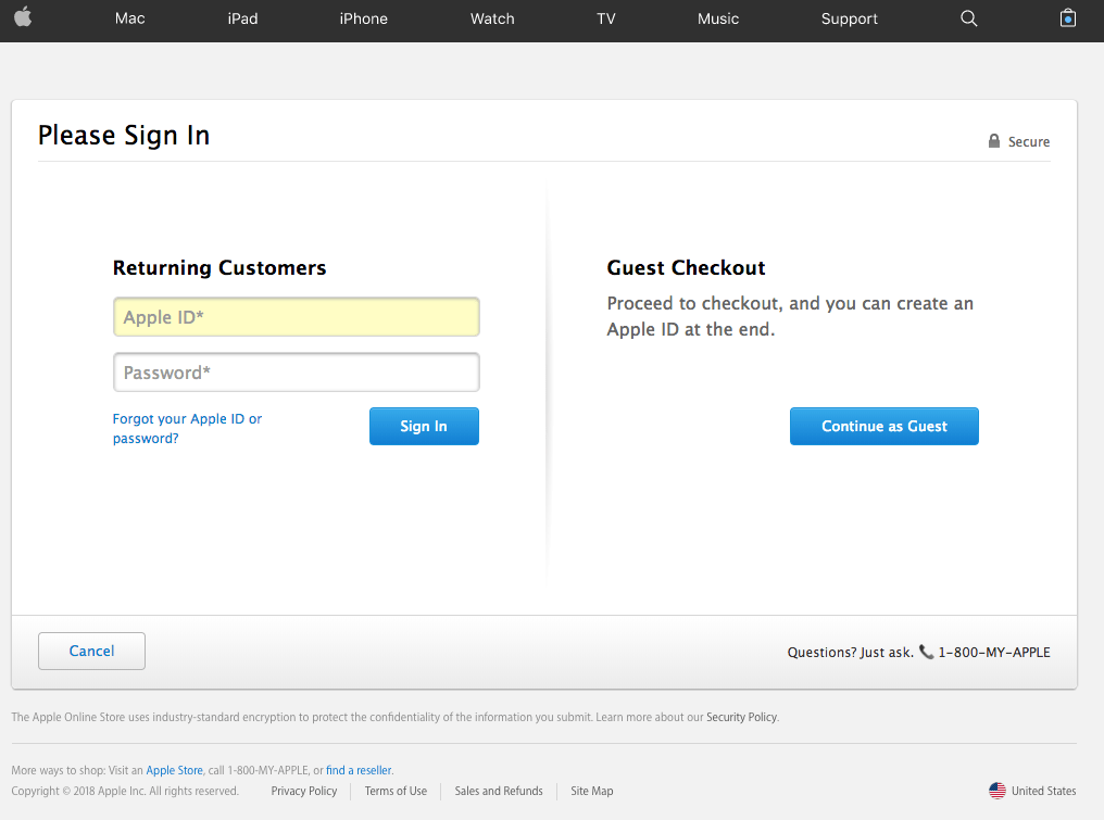
Apple exemplifies this approach with a sign-in page positioned between the cart and checkout stages.

pay1

Offering the option for users to log in using their existing Facebook or Google accounts can be highly beneficial. Many users are less inclined to manually create an account, but if the process can be completed with just a click of a button, they are more likely to provide their information.

Once an account is created, it’s important to clearly communicate the accepted payment methods. ASOS effectively accomplishes this by displaying payment options below the checkout button, coupled with subtle urgency cues.

pay2

Allowing users to log in using their Facebook or Google accounts is typically advantageous. Personally, I’m less inclined to manually create an account, but if I can do so with just a click of a button, I’m more inclined to provide my information.

Following account creation, it’s essential to transparently communicate the accepted payment methods. ASOS excels in this regard by presenting payment options below the checkout button, complemented by subtle urgency cues.

pay3

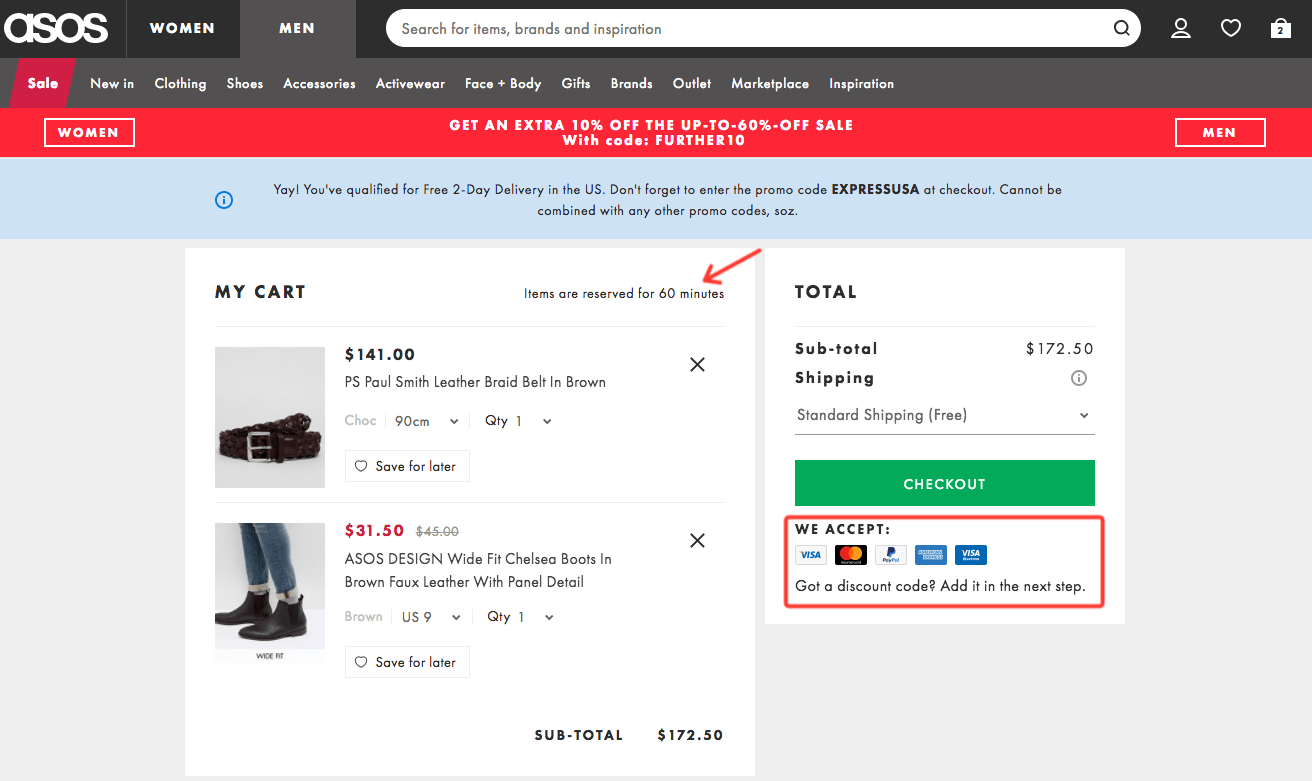
Including a note about discount code entry is a thoughtful detail – it prevents users from aimlessly searching your page for a spot to input their coupon codes. Keep in mind: unclear processes can deter conversions.

Streamline your cart and checkout pages to minimize friction. However, since many users will still abandon their carts, prepare to follow up with an email.


Best practices

Top 5 Strategies for Abandoned Cart Emails:

Content Components of an Abandoned Cart Email:

1. Conversational Tone:

Maintain a friendly and non-intrusive tone to avoid guilt-tripping the recipient. Strike a balance between encouraging the sale and respecting the recipient’s decision.

2. Product Display:

Showcase the abandoned product(s) to reignite interest and remind the recipient of their initial intent to purchase. Visual representation can help reinforce their desire for the product.

3. Highlight Benefits:

Emphasize the benefits of the product to activate loss aversion and encourage the recipient to reconsider their decision. Frame the benefits in terms of what they would miss out on by not completing the purchase.

4. Address Objections:

Anticipate and address potential concerns or objections that may have led to cart abandonment. Use customer research and feedback to understand common hesitations and provide reassurance.

5. Clear Call to Action:

Make it effortless for the recipient to continue the purchase by including a prominent and intuitive call-to-action button. Ensure clarity and simplicity in guiding the recipient towards completing their transaction.

Let’s explore some examples.

Abandoned cart email examples

23andMe: Short and to the point

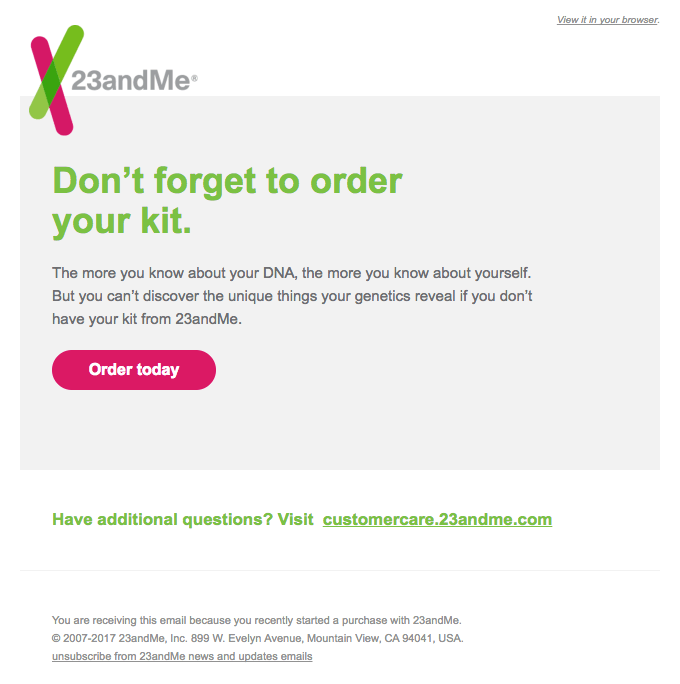
Source: 23andMe, via Really Good Emails

23andMe demonstrates that simplicity is key in effective emails.

This email succinctly outlines the benefits of their product, invokes a sense of loss aversion, and concludes with a prominently displayed button urging recipients to complete their order.

Simple, straightforward, and impactful.

Whisky Loot: Benefits, no objections

ex3

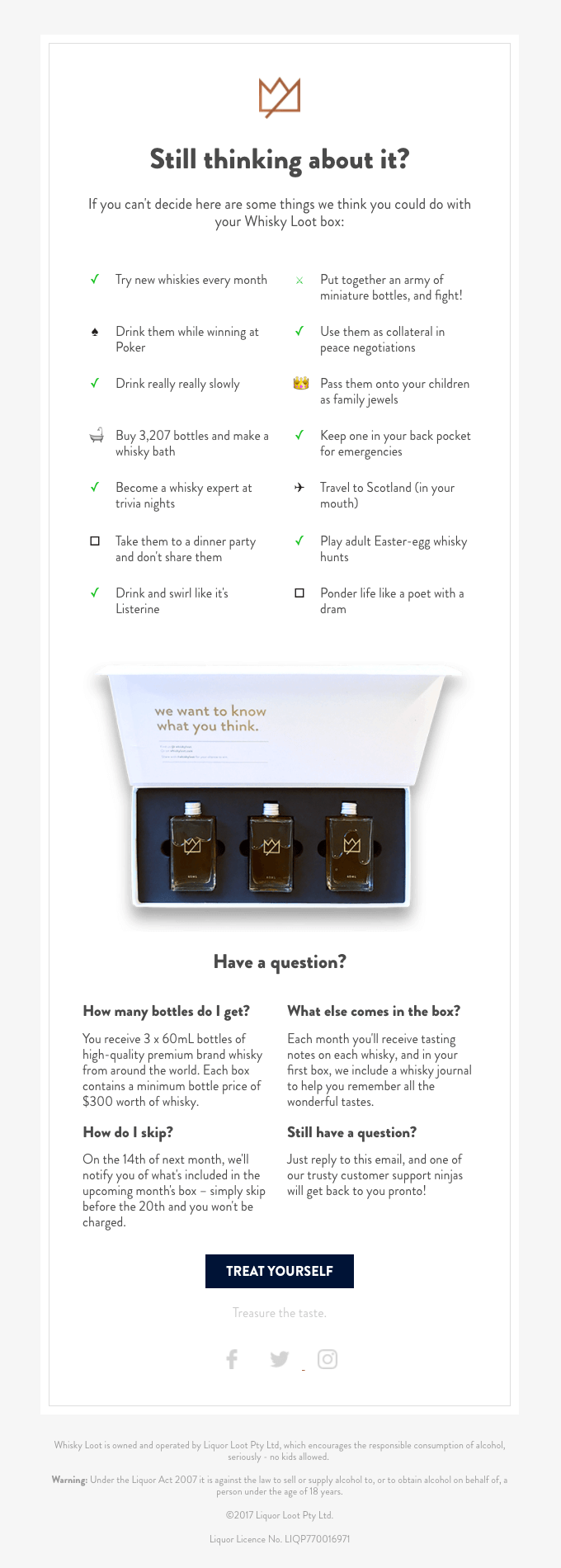
Source: Whisky Loot, via Really Good Emails

This email stands out by emphasizing the product’s benefits extensively. While it may be longer than usual, every section is utilized to convey its message effectively.

With a playful tone and humorous bullets like “drink them while winning at poker” and “drink and swirl like it’s Listerine,” it leaves a lasting impression.

Additionally, the email prominently showcases the product and addresses potential objections.

Ultimately, its effectiveness lies in its ability to help recipients envision themselves using the product.

Dollar Shave Club: Reducing risk with a guarantee

ex4

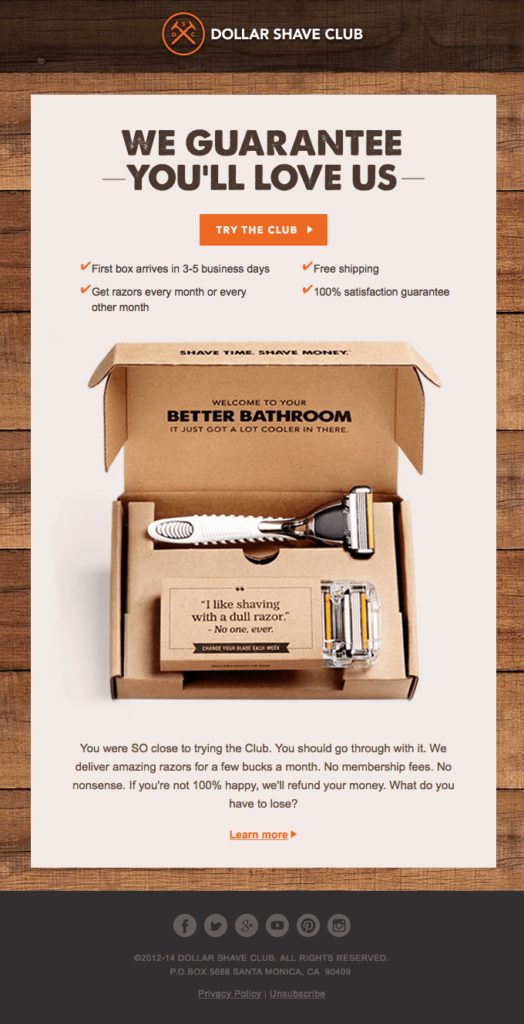
Source: Dollar Shave Club, via Really Good Emails

“What if this isn’t worth it?”—a common concern that every sale must address. Whether selling online or in person, customers seek assurance that their investment will yield value.

This email provides a visual depiction of the product and reinforces its benefits (who enjoys shaving with a dull razor anyway?). It prominently mentions fast, free shipping.

Most notably, it offers a guarantee: “If you’re not 100% happy, we’ll refund your money.”

Eliminating the risk associated with a purchase fosters trust and encourages more customers to buy.

Winc: Let the product shine

ex5

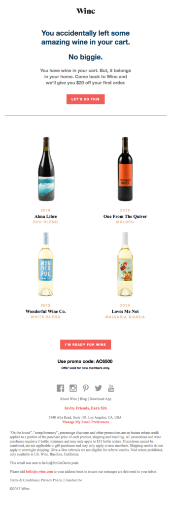
Source: Winc, via Really Good Emails


Conclusion

Conclusion: Beyond abandoned cart emails

Sales Titan enables users with connected Shopify stores to automatically trigger abandoned cart email reminders.

By incorporating automation into abandoned cart reminders, you can elevate your cart recovery efforts by recovering more carts and providing personalized product recommendations.

In Sales Titan, you can set up automations to trigger when a cart is abandoned. Moreover, you can segment your automations based on seven abandoned cart conditions:

1. Has Abandoned Cart
2. Doesn’t Have Abandoned Cart
3. Has Recovered Abandoned Cart
4. Has Not Recovered Abandoned Cart
5. Total Value of Last Abandoned Cart
6. Product Count of Last Abandoned Cart
7. Product Name in Last Abandoned Cart

For instance, using the last condition as an example, segmenting your automations enables you to follow up with specific product recommendations tailored to your customers’ interests.

Abandoned carts present an excellent opportunity for personalized marketing. Leveraging automation in abandoned carts empowers you to deliver the right upsell and cross-sell offers to the right audience at the right moment.